What Is Typography and How to Get It Right: A Beginner's Guide
Typography is taken into consideration particularly when designing a website, because it makes a difference to the visitor on the website. So, it is one of the most scrutinized terms.
What is Typography ?
It is an art of arranging text and letters in a way that makes it more readable, clear and visually appealing to the reader. Mainly it includes,
1. Font Style
2. Appearance
3. Structure
Also, it can be said that typography brings the text to life.
Typography has existed since the 11th century, but nowadays it is associated with both the digital world and print. Also, the advent of the internet is hugely responsible for the diversity in the fonts and font types, thus making typography more visually diverse than ever before.
Importance of Typography
1. Important parameter of user interface design
2. Strong Visual Hierarchy
3. Graphic Balance to the website
4. Set the product's overall tone
5. Ensures excellent user experience
6. Optimize readability & accessibility
7. Holds the attention of the visitor on the website
8. Impressive typography has deep effect on the way website information is perceived
9. Helps in carrying forward the company brand forward
10. Builds trust with user
Here is the list of eight important typographical design elements.
1. Fonts & Typefaces
2. Contrast
3. Consistency
4. White space
5. Alignment
6. Color
7. Hierarchy
1. Font & Typefaces
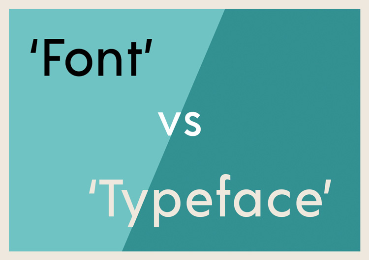
These two terms are often confused with each other or considered synonyms, but there is a huge difference between the two. A typeface is a collective name of the family or it is a design style that includes a large character of different sizes, and weight.
A font, on the other hand, is a simple graphical representation of the text character or a specific style within that typeface, such as bold, condensed or italic.
To cite an example, a blog post can be written all in one typeface but can include multiple fonts.
Basically, there are three typefaces, including: Serif, sans-serif, and decorative. A skillful designer will not keep more than three fonts. The best way is to keep Serif Fonts as title and Sans Serif Fonts as paragraph or vice-versa.
2. Contrast
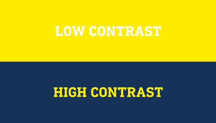
This is a way to highlight the idea or message in the way you want to emphasize to the reader. It is worth-while to spend some time on the text as it makes the content more meaningful and attention-grabbing. The contrast is mainly created by playing with the color, styles, sizes and varying types. It is also a way to create a sense of change of section and impact on the reader.
3. Consistency
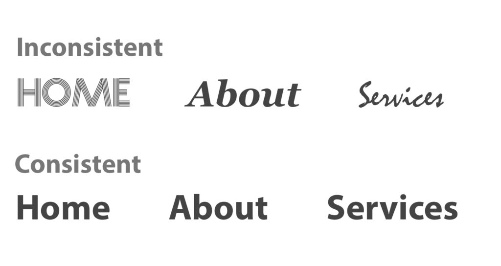
It is crucial to keep the typefaces consistent. This is to avoid creating messy interface and create a brand identity. Sticking to the same font styles, helps the reader understand the reading more precisely and notice the patterns. Consistency here implies is to choose consistent font for headers, and another for sub headings and stick to it. Through this way, a holistic experience using the same fonts and typefaces throughout.
4. White Space
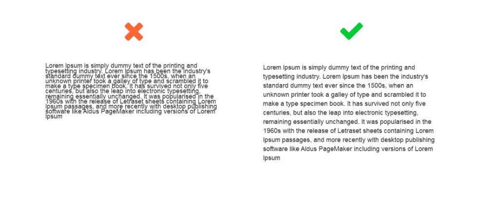
It is also referred to as 'Negative Space'. This space is found around text or graphics, and is often overlooked. But if a healthy amount of spaces are added then the text can become more readable and provides an overall aesthetically pleasing look to the website. These spaces include, margin, padding or areas without text or graphics, thus help in creating clear distinction between the blocks of information.
5. Alignment
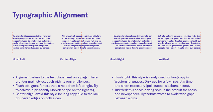
Alignment is the process of arranging the text, images or videos in such a way there is a symmetric space, distances and size in between each element. The alignment is used as per the industry standards.
- Left: Text aligned to the left side.
- Right: Text aligned to the right side.
- Center: Text is not aligned to any of the margin. This is more relevant for titles than for large amounts of text. It makes the text hard to read if the texts are long.
- Justified: Text is aligned along the left margin and the text flushes between left and the right margin.
6. Color
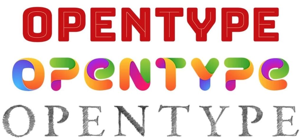
It is an important part of the typography. This is a chance for the designers to showcase the creativity and designing. Text color should be selected carefully, it where the website information will be displayed. The main thing that is considered while selecting the color is that it should be both eye-catching and clearly legible, even for those with visual impairment.
Conclusion
Typography is one of the most crucial concepts of User Interface Design, and mastering the concept is the only way to become a fantastic UI designer. The concept is much detailed and many professional designers have completed books on the same topic. But this article has covered all the basic things which are essential for communicating with the reader in the clear and easy to read. That is what matters the most.
However you can avoid this when creating websites using Darlic, by using pre-installed fonts that are set considering typographical demands.
